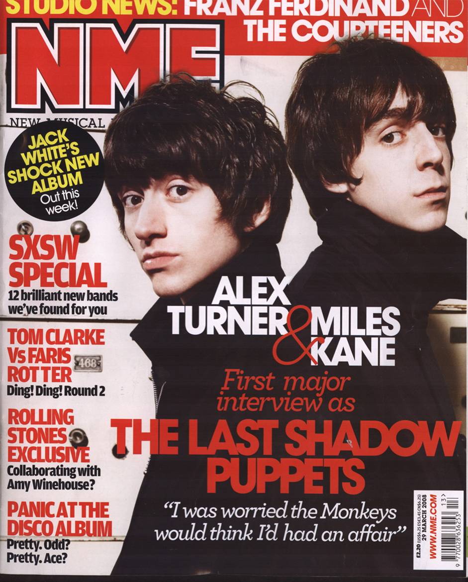

The top image is an NME music magazine and the lower one is my magazine, titled 'Lunacy' I have followed the codes and conventions of a real magazine through having a close up image of the artist, the masthead, cover-lines etc. This has taken my magazine to another level of a layout instead of a basic looking magazine with no structure. Following the codes and conventions also allows me to achieve the best looking magazine than going off the top of my head, as if the magazine was a real production line and printed official magazine of Sheffield music.
Contents Page


Here is my contents page and above is a contents page for KERRANG which is one of, if not the biggest music magazine company going, I am following the codes and conventions of a real music contents page through a pretty similar layout, the things they both have in similar are:
- Features
- Images (Teasers of the content)
- Page Numbers
- A Main Cover Image
- A Date
This all helps my magazine reach its full capability of looking like a real published/designed magazine as I have followed basic Codes & Conventions to make it look like magazines such as Kerrang and NME for example. These will all appear to the reader/target audience as the magazine won't look basic and easily/poorly created so that they feel they aren't waisting there time during the reading of 'Lunacy"
Double Page Spread


The top Double Page Spread is NME, talking on the Blur reunion for a real magazine, the bottom is mine. Both magazines have a similar layout and also helps me follow the codes and conventions through:
- Main image of who the interview/article is about
- Articles in columns
- Basic colours
- Basic fonts
These all help Cath the readers eye as they have been constantly used by NME and other famous magazines for years and years, The questions are also in colour which have also been done by NME and companies such as ID and Q magazine. I am happy I have taken this style into consideration while creating my magazine as this makes my magazine reach out to the reader, and it is also a huge strength as it will allow my magazine to reach many more readers than expected (hopefully)
The photographs and the language used in my DPS fits the gene of a real magazine and also reach out to my target audience as Stan playing his guitar instantly has that music vibe which connotes the magazine is about music, the interview also fits the genre as it is in direct address, the questions asked are answered exactly as the artist says, he also speaks very laid back and chilled out with the artist, slack and lazy vibe about him.

No comments:
Post a Comment