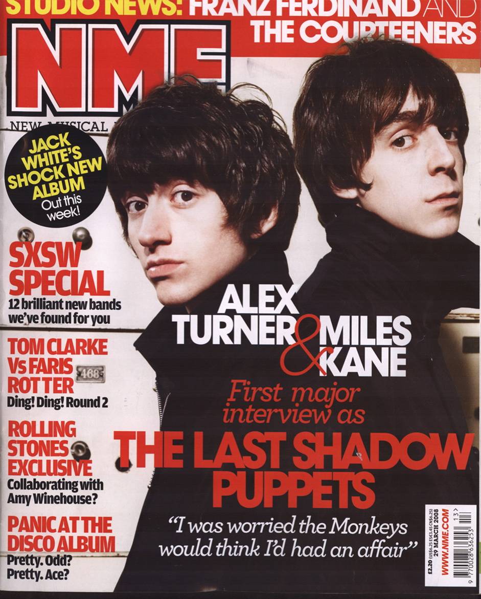
Here I have set up my front cover page to the specific heigh and width with a 300 resolution, I have done it to these measurements based on real magazines and with a 300 resolution for the best quality
I have made the front cover image to black & white through using the Greyscale mode and also using levels and brightness & contrast for the perfect whites, blacks and greys to connote the dirty, grungy side of indie rock and the dark sides of it not everybody can see.
Here I am added boxes for the text to stand out more and have their own space on the magazine rather than being used with the background they have their own black text box. To do this I have used the rectangle box tool for perfect dimensions of my choice and for the perfect shape to my preference. This helps fit the music genre as everything will stand out that has something to do with the new artists of Sheffield
Here I have added a QR Code for the target audience to scan which will take them to Lunacy's instagram page that will give them in-sights into the next issue of lunacy and also new gossip of Sheffield music artists and some of the content in the next issues/release dates. I am still using the Ariel Black font all the way through the magazines front cover so that it is repetitive and also not distracting from the rest of the front covers content.
For the win circle I have used the Ellipse tool for a perfect circle measurement to my preference and made the text of the win bigger than the rest so that it will catch the target audiences eye and realise they can win products through this magazine. This helps fit the genre as the music audience will want more music magazines.
I have added the artists name 'Stanlop' so that the readers know straight away who has said the quote on the front page of wanting to create the new wave, this is also used so that the audience know who the artist is on the front cover page as soon as they look at it.
Here I have made the font size of the artist 'Stanlop' and completely stretched it out so that it's the second biggest font on the page, the masthead being the first. This will tell the audience straight away who the artist is on the front cover through standing out.
Here I have used the layer style in photoshop so that I can add a drop shadow into the font, I change edit the distance of the shadow from the font, the size and how far it spreads out, I have set it to the perfect measurement for a shadow on the font. I have also changed the noise in the quality of the shadow so that it creates distortion in the shadow, doing this will help connote the magazine being titled lunacy (becoming insane) by used a distorted effect that looks very grungy linking with the indie rock genre of my magazine.
I have added a banner on top to catch the readers eye and see there are free gifts/items which all music lovers enjoy getting band posters. I have also turned up the exposure and levels so the artist is more visible instead of being dark and harder to see.

This is the start of my article for my double page spread, I have started off with basic questions which work perfectly for the target audience to get their head round this artist, my next edit on my article will be more in depth questions for the target audience to really understand what this artist is getting up to in his spare time.
with this feedback I now need to add a couple more questions about the music and about gigs so that the audience really feel that they know the artist once they have read it.


